Darts : Learn how to simply perform time series analysis and forecasting in Deep Neural Networks!

Anyone who works with time series will tell you that they are unique creatures. Scikit-learn may be used for the majority of machine learning tasks when working with tabular data, such as pre-processing, prediction, splitting test data and model selection. However, the plot is not the same with time series. It is not unusual to encounter circumstances in which various libraries are required for different tasks. For example, you may need a third library to train a forecasting model (such as ARIMA), Pandas to compute missing values and scale it, another library to identify seasonality, and you will almost certainly need to design your own backtesting and model selection methods. Darts, like scikit-learn, uses the fit() and predict() methods. Darts is similar to scikit-learn, but with added features for time series data. The library also allows you to backtest your models, integrate their predictions, and analyse many models at the same time. Darts supports univariate and multivariate statistics and models. Furthermore, all Neural Networks and Regression models may be trained using various time series.
Overall, time series implementation seems very complex; however, the “UNIT8” team has simplified the work to the point that Data Engineers may use the same method they used for the scikit-learn packages. I would want to thank the Unit-8 team for producing such an amazing product and give them all the recognition they deserve. For more interesting content, check their GitHub repository using the link provided below!
So, What exactly Darts is?
Darts strives to provide scikit-learn experience for time series in order to provide the simplest time series approach. Darts is a Python library for time series forecasting and identifying anomalies. It includes a wide range of models, from classics like ARIMA to deep neural networks.
And, Why Darts?
- An easy-to-use interface for defining and fitting models.
- Support for several time series data types, including univariate, multivariate, and panel data.
- ARIMA, Exponential Smoothing, Prophet, LSTM, and TCN are among the built-in models.
- Cross-validation and grid search are examples of hyperparameter tweaking and model selection tools.
- Exploratory and analysis tools for time series data and model outputs.
In this post, I will try to implement few models on the dataset that I have chosen randomly from Kaggle (Google Stock Data). I will be showing you that how Darts library has made our life so easy. Even without any prior extensive knowledge about the model you could implement varieties of model on your dataset and see which one is giving you the best results. I am using Jupyter Notebook here but, you can use any python IDE according to your preference. Let’s begin:

In order to provide the groundwork for effective analysis and model assessment, we first install the Darts library, simplify the environment for time series forecasting by importing necessary modules, and configure an eye-catching charting style using Plotty and maybe Seaborn.

Loading the dataset and checking the first 5 rows with data.head(5) command.


Firstly, selecting the two main columns “Date” and “Close” from the “data” DataFrame. The most recent 501 rows of data are then extracted, the index is reset, the “Date” column is formatted as datetime, and finally the length of the generated DataFrame is printed.
Secondly, I’m executing three primary operations on a pandas DataFrame df2. To avoid modifying the original data, it first produces a replica of df2. It then changes the DataFrame’s index to the ‘Date’ column, allowing time-based indexing. Finally, it eliminates the now-redundant ‘Date’ column, leaving a DataFrame indexed by date and ready for time series analysis.

I’m using Plotty to create a line graph; you can read their docs for more information.

At this point, I’m creating a list of dates between June 30, 2020, and January 1, 2022, excluding the end points. I then transformed the start and end dates to datetime objects. It then iterated over the days between these two dates, incrementing the date using a for loop and timedelta. Within the loop, each date is converted to a string in the ‘YYYY-MM-DD’ format and added to the list ‘dates0’. Finally, it prints the first and last five dates in the created list.

Creating a DataFrame termed dfDates with a single column named ‘Date’ and then converting the data in that column to datetime objects using the pd.to_datetime method.


Using merge function to merge the DataFrame ‘dfDates’ with DataFrame ‘df’ based on the ‘Date’ column, thereby duplicating each row. Then, I fill in any missing values in the resulting DataFrame, basically propagating non-null values from previous rows to fill the null values.

Here I’m creating a time series object named series_stock from a DataFrame (dfDates), which contains stock data. The function uses the ‘Date’ column as a time index and the ‘Close’ column for values. Then, it displays the type of the series_stock object, which might be a particular class representing time series data from a library like pandas or statsmodels. This approach allows for simple modification and analysis of stock data over time, making activities such as trend analysis and forecasting easier.


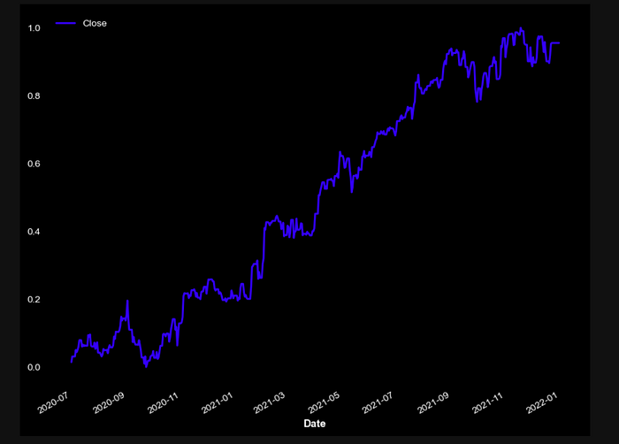
Plotting stock price time series data using a scaler in Pandas. And I presented the scaled data with a disabled grid, displaying the closing prices over time. Again, if you want to make some changes, please check the documentation.

Now, I’m dividing a stock price dataset into two sets: a training set (train_stock), which contains the first 400 data points, and a validation set (val_stock), which contains the rest.
The N-BEATS forecasting model is then initialised with certain parameters such as input chunk length of 24 (number of historical data points to consider), output chunk length of 12 (number of future data points to predict), and trained for 100 epochs with the training data.
During training, the models progress is shown using verbose output. Our model’s goal is to learn patterns from previous stock data and anticipate future stock values.


And now, yeah, we did it. Let me explain the graph that depicts data over time. The x-axis displays the date, while the y-axis represents an unlabeled value. The graph has two lines: “actual” (blue) and “forecast” (red).
The blue line shows a steady increase over time until it intersects with the red forecast line. After this intersection point, both lines proceed together for a short period before diverging. The actual line shows a decline, while the forecast line continues its upward trend.
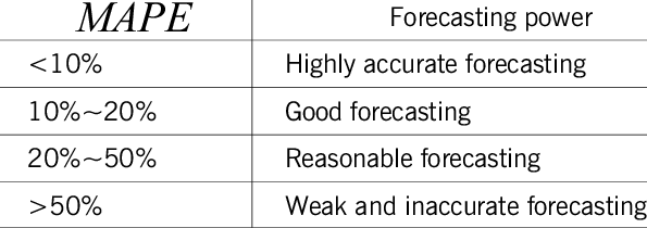
The text at the top left corner indicates “MAPE: 6.37536858448876”, which refers to the Mean Absolute Percentage Error, a measure of prediction accuracy in forecasting. This suggests that the graph is comparing actual and forecasted data trends over time, highlighting an instance where they diverge significantly after initially aligning, indicating an inaccurate forecast. The MAPE criteria for evaluating models are as follows:

That’s all, guys! I’d love to hear your ideas, feedback or suggestions. Your thoughts are important in pushing me to improve my ideas and broaden my understanding. Feel free to leave your thoughts here or contact me personally on LinkedIn — https://www.linkedin.com/in/umesh-kumawat/
